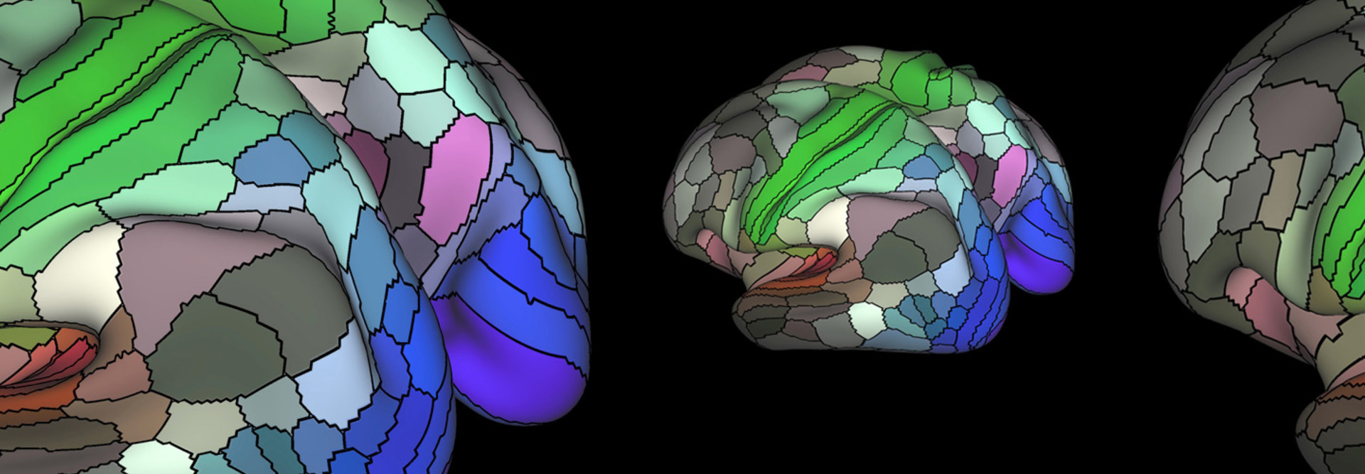
This map of the 180 areas of the human cortex was developed from research data funded by the National Institutes of Health.

Nov 05 2018
Software

Feds Embrace Data Visualization to Analyze Complex Information

NIDA, DHS are among those deploying data visualization tools to better understand and explain the flood of incoming info.

The National Institute on Drug Abuse staffers in charge of evaluating grants turn to data visualization tools to help them make informed decisions when soliciting, reviewing, awarding and managing the millions of dollars available for research.

At the same time, industry and academic scientists whose work is supported by NIDA also employ data visualization and analytics tools to search massive data sets for unseen patterns relevant to their research.

Using data effectively for messaging, decision-making and research is critical to the mission of every federal agency, whether it’s working on health research or national security. Data visualization tools turn data and numbers into pictures that display a far clearer view into information than agencies have ever had, and let employees manage the growing flood of data more efficiently.

“When program staff at NIDA report on the solicitation, review, award and management of grants, they use databases to inform their responses,” says Roger Little, deputy director of NIDA’s Division of Neuroscience and Behavior. “Scientists can access government and other databases and bring them together to mine them for insights into topics as diverse as national behavior trends or genetic signaling at the cellular level.”

MORE FROM FEDTECH: Discover how agencies can use government data to drive innovation! 

NIH Deals with a Huge Amount of Data 

The technology and skills for data visualization and analytics are becoming necessary for all agencies, whether the tool is commercially available (such as Tableau, Qlik or TIBCO Spotfire) or developed internally.

“Everyone deals with data — in the case of government, huge amounts of data,” says Nick Desbarats of Practical Reporting, a data visualization consultancy. “For audiences of decision-makers and the public, data visualization is a powerful communications tool.”

The National Institutes of Health, of which NIDA is a part, makes several visualization and analytics tools available to staff in its online NIH Library, including Tableau. In addition, the agency uses Splunk.

Roger Little
Combining large data sets from different sources can be used to answer questions in a way that was previously unfeasible"

Roger Little Deputy Director, Division of Neuroscience and Behavior, National Institute on Drug Abuse

Photography by Drake Sorey

Blending those with in-house tools, such as NIH’s Query/View/Report system and Research Portfolio Online Reporting Tools, scientists can mine the results for insights into topics as diverse as national behavior trends or genetic signaling at the cellular level.

They can gather information and look for patterns on the financial level as well; for example, in grant applications and awards, budget publications or patents.

“Combining large data sets from different sources can be used to answer questions in a way that was previously unfeasible,” Little says.

Big Data science and innovations in data visualization have already provided new insights into many areas of science, including neuroscience and cancer.

“This is particularly relevant to NIDA’s mission, as it has the potential to be extremely useful for providing new information about addiction, including the gene, cell and circuit interactions that underlie the biology of addiction,” Little says.

MORE FROM FEDTECH: Find out why the State Department sees data as a strategic asset! 

DHS Uses Data Visualization to Enhance Cybersecurity 

The Department of Homeland Security’s Continuous Diagnostics and Mitigation Program uses data visualization technologies as part of the suite of tools and capabilities that protect civilian government data and networks, says CDM Program Manager Kevin Cox.

“The data visualization tools help agencies and the CDM quickly identify where they need to take action, whether it’s to combat an urgent threat or to stay ahead of threats by strengthening protections,” he says.

Participating agencies place sensors on their networks to enable continuous monitoring of their systems, to assess how well systems are configured and to look for potential vulnerabilities and intrusions in progress. The sensors also detect what devices and users are on the network at any given time; they check users’ access privileges, whether a device is authorized and how well it is secured.

Data from the sensors is pulled into an integration layer and then fed into data visualization tools, including Archer and Splunk. This creates a dashboard of views for DHS decision-makers assessing and responding to issues with the networks, says Cox.

“Data visualization and analytics helps us craft an overall picture of how cybersecurity is working across the federal government and see if we’re maintaining proper protections around high-value assets,” Cox says.

Through CDM, in partnership with the General Services Administration, DHS is providing agencies with off-the-shelf, commercially available tools, Cox says. The effort is aimed at fortifying and rationalizing the cybersecurity infrastructure while improving efficiencies.

13 Milliseconds

The amount of time it takes the brain to process an image

Source: news.MIT.edu "In the blink of an eye," Jan. 16, 2014

GSA maintains an acquisitions list of products, such as Archer and Splunk in the visualization and analytics space, that meet federal standards and criteria. Buying from the list shortens the acquisition process.

“Visualization and analytics are already critical to our work and will only become more important because we have so much data,” says Cox. “Without the technology, we’d just be dealing with an overwhelming number of data points with no effective way to present it.” 

MORE FROM FEDTECH: See how HHS embraced big data to help battle the opioid crisis!

DPAA Turns to Data to Identify POWs 

The ultramodern technology is also being brought to bear on missions that began decades ago. The job of the Defense POW/MIA Accounting Agency (DPAA) is as daunting as it is solemn: finding and identifying the remains of the 83,000 Americans lost from World War II through Operation Iraqi Freedom, including those recently brought home from North Korea.

With the information presently available, DPAA estimates that 34,000 of those missing can eventually be identified with the assistance of data visualization and other modern technologies.

“Data visualization gives us one of the best ways to start sorting through the universe of information we have about any individual or group of the lost,” says DPAA Chief Data Officer Christopher McDermott.

DPAA’s arsenal of visualization and analytics technologies includes Qlik Sense, GIS tools for mapping geospatial and archeological data, and several other applications developed within the agency.

The applications target a growing number of data sets, starting with witness stories that might yield clues to a service member’s fate, and including mission records, medical and dental records, DNA evidence and more.

DPAA is also developing partnerships with academic institutions and genealogical research organizations to gain access to more databases and additional expertise, says McDermott.

“Our increasing success in finding and identifying individuals has been enabled by our new data analysis capabilities,” he says. “We have a much clearer view of how the evidence connects.

“These technologies can also give us more certainty about an identification, more safeguards against mistakes. Given our mission, we take that as a solemn responsibility.”

Digital%20Transformation_IR_1%20(1).jpg

Matthew Glasser and David Van Essen/ Washington University
Close

Become an Insider

Unlock white papers, personalized recommendations and other premium content for an in-depth look at evolving IT